
When is advancement, well… not? When the fancy new kiosks at Panera are as bad as these are.
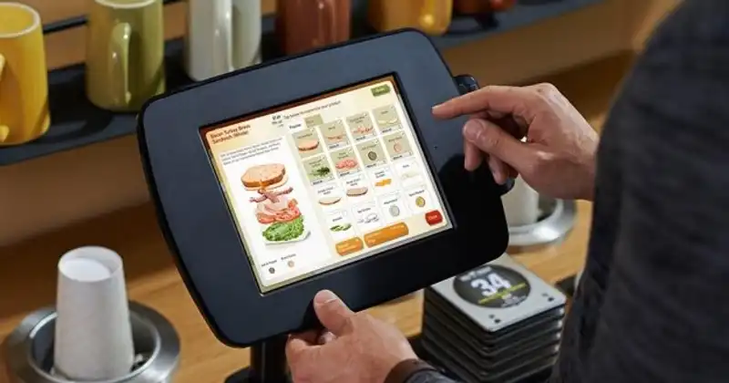
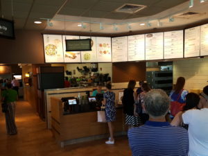
I was in Chicago visiting a friend who was ill. His wife and I ventured out to Panera to pick up lunch for the group, and when we arrived, we were greeted with a 12-15 person long line for the one open register. As we chatted and waited, I noticed the banks of unused kiosks on both sides of the queue flanked with marketing pizazz.
“Man, imagine how crappy it would be to invest in new tech and marketing and have nobody care,” I remarked.
“Oh crap. Let’s give it a try. It has to be faster,” Colleen answered.
Famous. Last. Words.
The kiosk experience began with a screen that seemed to require you to sign in to your Panera account. It doesn’t. But Colleen understandably wrestled with this for a few moments as another person in the long line advanced through next to us. Once Colleen got past that hurdle, it was time to order. This is a simple process that countless eateries have solved. She finished the first person’s meal and needed to move to the next. I watched her struggle as the UI did not seem to have a way to “add to cart” (a construct most kiosk users and online shoppers are familiar with.) She navigated away from that order to add another only to find the first one had disappeared multiple times. As her frustration mounted, I paid more attention.
“OK. I am pretty smart. What the heck is going on?”
This is what the heck was going on. (Bad photo credit, me.) I reproduced this problem weeks later at a Panera in Celebration, FL. Fortunately, the exact same problem was in effect with the notable exception of two poor ladies struggling with kiosk bank 1, which forced us to use the kiosk next to the registers, making it look like we were trying to cut in line.
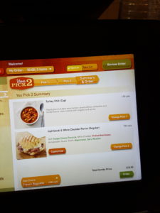
See the little green “ORDER” button? As it turns out, that is the “Add to Cart” equivalent. It does NOT mean place your order. It means “order this part, but not really order it. Place it in the cart and then order some additional stuff or review your cart and then, for real though, order that stuff.”
This foolishness is akin to changing the shape, color and word on a STOP sign and assuming people will just “get it” when they pull up. I don’t know how much Panera paid for this, but whatever it is was too much. Furthermore, it is actively hurting them. (And it is most likely a very easy fix unless the architecture of the application is as bad as the UI/UX.)
When we finally figured it out, we noticed that not only had the line we were in already been processed, but multiple new people had received human services in the meantime.
Morals
- Encourage the behavior you want
- Support the desired path with beautiful simplicity
- Don’t force a new behavior adoption unless there is a clear advantage